Directory
Design Systems
Jump to the company's canonical documentation — 221 full design systems with components and tokens, plus brand / trademark guideline pages.

Design System
Ant Design
alipay
The open-source enterprise design system born inside Ant Group (Alipay's parent), now the most influential Chinese design language and one of the most widely adopted React component libraries in the world.

Design System

Base Web
uber
Uber's React implementation of Base — a living component system.
Design System

Bezier
channeltalk
Channel Talk's open-source design system — Bezier (MIT). Inter + Noto KR/JP type stacks, token/component/icon packages, marketing-vs-product type cliff documented.
Design System

Carbon
ibm
IBM's open-source design system with React, Angular, Vue, and Web Components.

Design System

ClickHouse Design
clickhouse
ClickHouse brand hub plus the Click UI design system and component library.

Design System

Fluent 2
microsoft
Microsoft's cross-platform design system — Segoe UI type ramp, brand color ramps, motion/curve tokens, and component guidance for web, Windows, iOS, and Android.

Design System

Geist
vercel
Vercel's design system with 50+ components, foundations, and brand resources.

Design System

Gestalt
pinterest
Pinterest's open-source React component library with tokens and foundations.

Design System
hahow-design
hahow
Hahow's open-source design-system theme — Primary/Secondary token scales (Primary 500 #00ccb4).

Design System

Helios
hashicorp
HashiCorp's design system documenting components and foundations.
Design System

Human Interface Guidelines
apple
Apple's official design guidelines for iOS, macOS, watchOS, and visionOS.

Design System
kdan-ui
kdan
Kdan's open-source UI token library (kdanGreen brand token + neutral scale + semantic colors).
Design System

KRDS — Korea Republic Design System
krds
행정안전부 주관 범정부 통합 디자인 시스템. Government Blue #256EF4, Pretendard GOV, WCAG/KWCAG 2.2 a11y-first tokens and components.

Design System

LeafyGreen
mongodb
MongoDB's open-source design system with an extensive React component library.

Design System

Lightning Design System 2
salesforce
SLDS 2 — Salesforce's agentic-era design system built on CSS custom properties (global styling hooks, --slds-g-*), shipping the canonical brand-blue scale, semantic color ramps, radius/spacing/shadow scales as machine-readable tokens (@salesforce-ux/sds-styling-hooks).

Design System

LINE Design System
line
LINE's shared design system for products across the LINE family.

Design System

Material Design 3
google
Google's open-source design system — color roles, type scale, shape and motion tokens used across Android and Google products.
Design System

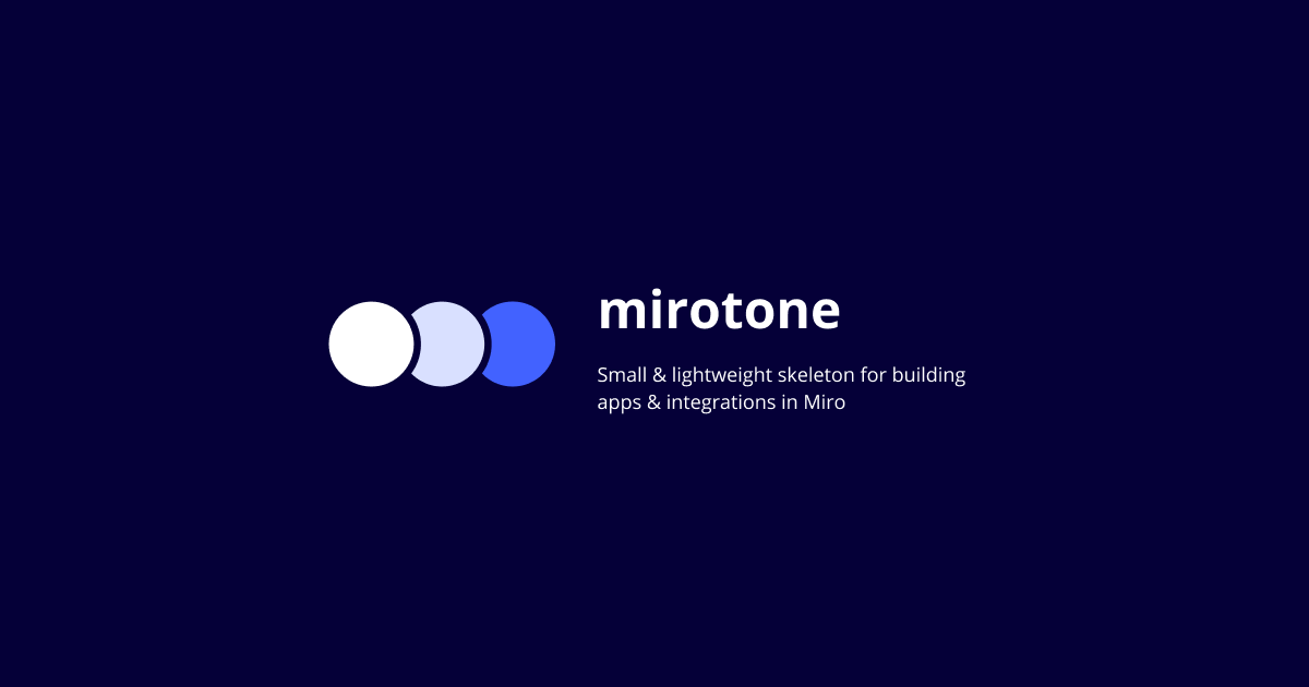
Mirotone
miro
Miro's CSS component library for apps built on the Miro platform.

Design System
Money Forward Cloud UI
money-forward
Money Forward's open-source React component library and theme tokens for the Money Forward Cloud business suite — buttons, forms, and a typed styled-components theme published on GitHub.

Design System
Remember UI
remember
Remember (drama&company) UI library — public Storybook deploy with components for the business-card / B2B networking product.
Design System

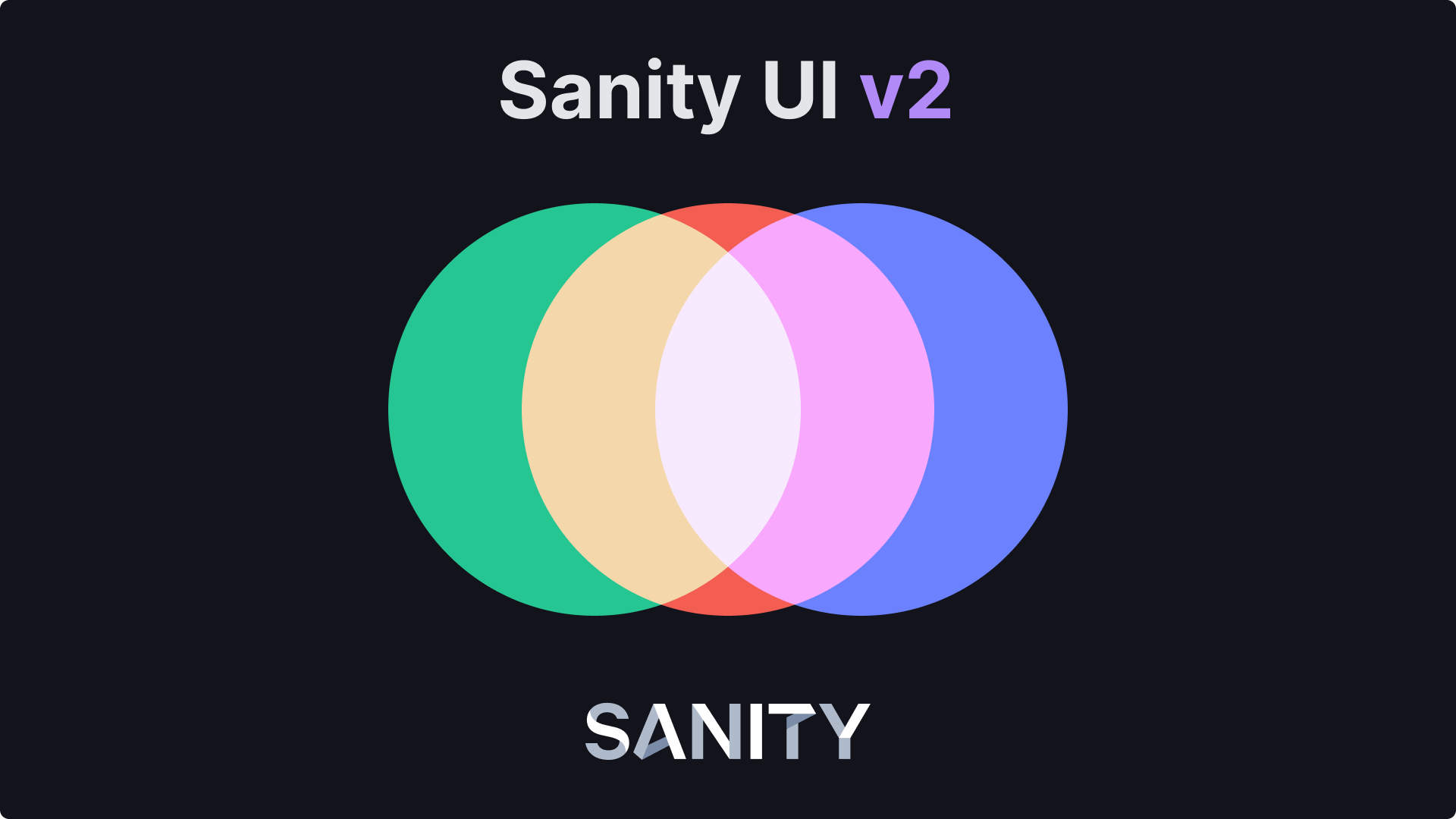
Sanity UI
sanity
Sanity's accessible React toolkit for building apps with design tokens.

Design System

SEED Design
karrot
Karrot (Daangn)'s open-source design system for marketplace apps.

Design System
Sendbird UIKit
sendbird
Sendbird's official chat UIKit — a documented, token-driven conversation-UI system (React, iOS, Android, React Native) with named color sets, message components, and themeable light/dark resources.

Design System
SmartHR Design System
smarthr
SmartHR's fully public, governance-driven design system — primitive and semantic tokens, accessibility-first components, and inclusive UI guidelines published openly at smarthr.design.
Design System
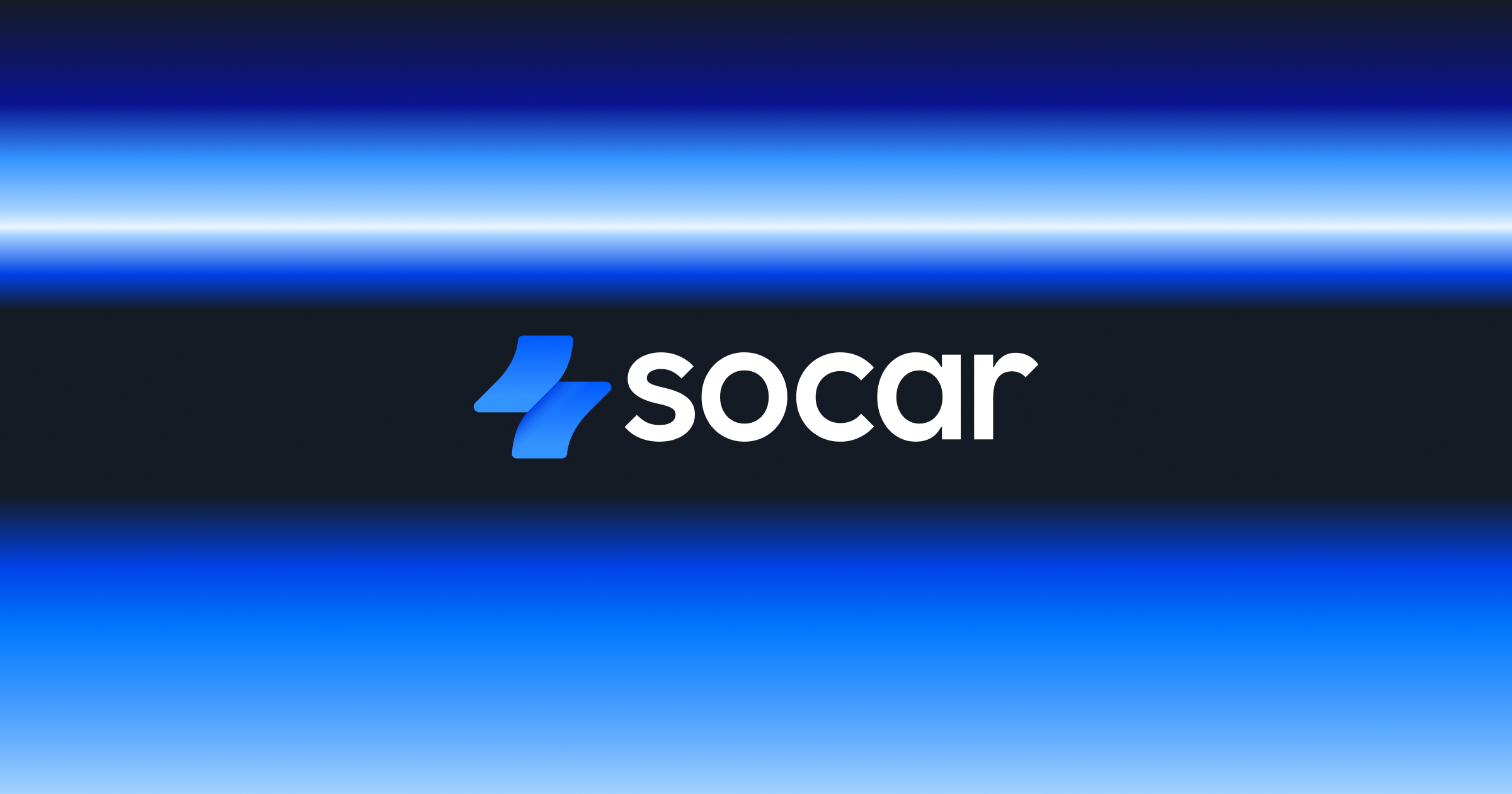
SOCAR Design
socar
SOCAR's design system hub — Space Frame, SOCAR Blue, Sandoll Gothic Neo2 + Avenir typography, and mobility-flow component patterns.

Design System
Spectrum
adobe
Adobe's design system. Spectrum 2 (s2.spectrum.adobe.com) is the current generation — blue-900 #3b63fb accent, 16px pill geometry, Adobe Clean Spectrum VF.

Design System
TDS
toss
Toss's mobile design system — 40+ components, tokens, and hooks.

Design System
TOAST UI
nhncloud
NHN's official open-source component library (TUI Grid/Editor/Calendar/Chart/Image-Editor), MIT-licensed under the nhn GitHub org and documented at ui.toast.com.

Design System
NEW
Ubie Vitals
ubie
Ubie's open-source design system — tokens, 25+ components, icons, and UX writing for healthcare products.

Design System
velog (open source)
velog
velog's production frontend is fully open-source (MIT); its design tokens live in src/lib/styles (themes.ts + palette.ts), built on the Open Color palette.

Design System

Vibes
freee
freee's open-source design system with accessibility-focused components.

Design System
Wanted Montage
wanted
Wanted's Montage design system docs — components, foundations, Wanted Sans, and the brandcenter resource hub.

Design System

Wise Design
wise
Wise's design system covering foundations, components, patterns, and tone of voice.
Design System
여기어때 Design Library
yeogiotte
여기어때 디자인 라이브러리 — A Visual Language for Travel. Foundations, components, and tokens.
Brand

Airbnb Brand Hub
airbnb
Airbnb's brand guidelines hub with logo, color, and visual identity rules.
Brand

Airtable Trademark Guidelines
airtable
Airtable's trademark usage and brand guidelines.

Brand
Banksalad GitHub
banksalad
Banksalad's public GitHub org including styleguide repos and BPL (Banksalad Product Library) reference material.

Brand

Clay Newsroom
clay
Clay's official press kit and co-branding guidelines.

Brand

Cohere Newsroom
cohere
Cohere's press kit with logos, symbols, and media resources.

Brand
Coinone Brand Guideline
coinone
Official BI/brand guideline (v4.0) — Coinone Blue color system, signature logo lockups, clear-space rules.
Brand
Coupang Media Assets
coupang
Coupang's official media-asset brand guidelines — logo usage, sizing, and attribution rules.
Brand

Cursor Brand
cursor
Cursor's brand guidelines with logos, icons, and naming conventions.

Brand

Dropbox Brand Guidelines
dropbox
Official brand site (dropbox.design redirects here) — framework, voice & tone, logo, typography, iconography, color, imagery, motion.
Brand

ElevenLabs Brand
elevenlabs
ElevenLabs brand guidelines covering logo, symbol, and product sub-brands.
Brand

Expo Brand
expo
Expo logo/wordmark trademark and usage guidelines.
Brand

Figma Brand Guidelines
figma
Figma's official trademark and brand usage guidelines with logo downloads.

Brand

Framer Brand Guidelines
framer
Framer's brand and trademark guidelines with logo rules and color palette.
Brand
Gangnamunni Blog
gangnamunni
Healience design team blog — the Cell + Welchis two-system architecture behind Gangnamunni's medical-platform UI.

Brand
Gmarket Sans
gmarket
Gmarket's SIL OFL brand typeface — 3 weights, TTF/OTF, 11,172 KR glyphs. First-party font artifact from a 25-year-old open marketplace; backing 247 :root CSS vars + Smile Yellow #ffd200 + Club/Event/Service sub-systems on the storefront.

Brand
Hyundai Card Design Library
hyundaicard
Hyundai Card's official Design Library — the brand's design philosophy, the proprietary Youandi typeface, and visual identity.

Brand

KakaoBank Brand Resource
kakaobank
KakaoBank Brand Identity Guidelines V2.0 — logo system, KakaoBank Yellow #FFE300, downloadable CI assets.

Brand
KakaoPay Story
kakaopay
KakaoPay's design narrative blog — 3 pillars (Color · Icon · Type), the 3:1 contrast accessibility policy, and the KPDS internal design system context.
Brand

Linear Brand
linear
Linear's brand guidelines with wordmark, logomark, and color specifications.
Brand

Mistral Brand
mistral
Mistral AI's logo, colors, typography, and brand asset kit.
Brand

NAVER Brand Resource
naver
NAVER Corp's official brand guide — logo usage, NAVER Green #03C75A, and identity rules.
Brand

OpenCode Brand
opencode
OpenCode's terminal-oriented logo and brand assets.
Brand

PostHog Brand Assets
posthog
PostHog's public handbook brand, logo, and illustration guidelines.

Brand

Raycast Brand
raycast
Raycast's brand guidelines with colors, logos, and asset kit.

Brand

Resend Brand
resend
Resend's brand guidelines with wordmark, icons, and naming rules.
Brand

Supabase Brand Assets
supabase
Supabase's brand guidelines with logos and integration button specs.
Brand

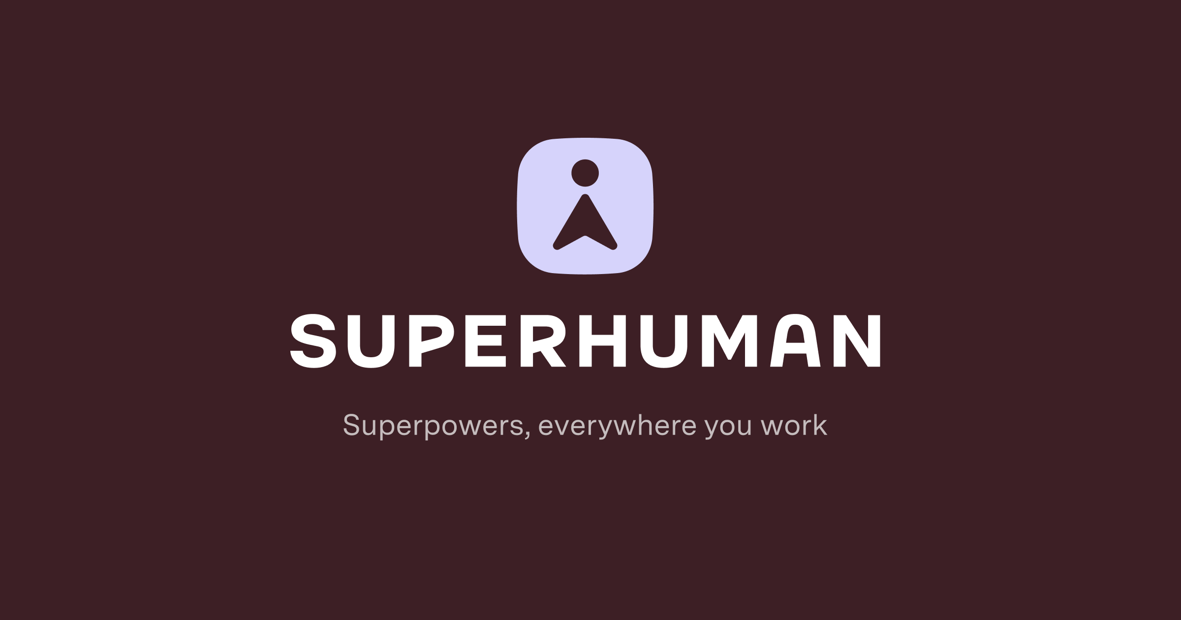
Superhuman Media Assets
superhuman
Superhuman's press and brand asset kit.

Brand

Together AI Brand
together
Together AI's logo, color, and typography brand guidelines.

Brand
Upstage Brand Resource Center
upstage
Upstage's brand resource hub — logo / symbol assets + IP rights statement. Token spec lives only in production CSS (Geist + Espeak proprietary face + violet #5B52FF × plum #3C043B + Solar accent #D2FF95).

Brand
Whoscall Brand Guidelines
gogolook
Whoscall's official brand page — logo, the documented brand green #0CD25F, and usage guidelines.
Brand
Yanolja Brand Center
yanolja
Yanolja's official brand center — visual identity inspired by the Multiverse of Dreams.
Brand

Zapier Brand
zapier
Zapier's official brand guidelines 1.0.

Brand
ZIGZAG Tech / Brunch
zigzag
Kakaostyle / ZIGZAG's brand & design articles — the ZDS (ZIGZAG Design System) rearchitecture and the 2021 cool-pink rebrand.