Design System Inspiration of MOZE
1. Visual Theme & Atmosphere
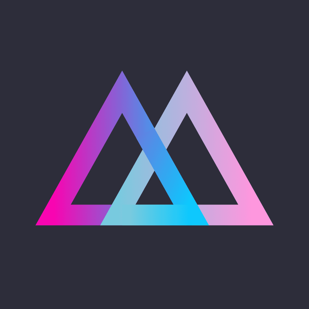
MOZE (摩斯, "最美記帳 App") is Taiwan's design-forward personal-finance and expense-tracking app, and its marketing site is built as a dark, cinematic, almost-luxury product showcase rather than a utilitarian tool page. The canvas is a near-black blue-tinted ink (#0d0d12) layered over true black (#000000), so the whole surface reads like a high-end gadget unboxing in a dimmed room. Against that darkness the brand stages a single, unmistakable signature: a vivid pink-to-periwinkle gradient (#ff367c → #6e86ff) that runs through the primary download CTA, the highlighted pricing tier, and the triangular "M" app icon itself. The atmosphere is premium-but-playful — the restraint of a black canvas paired with the energy of a saturated neon gradient.
The typographic personality splits cleanly along a Western-display / CJK-body line. Display headlines run in Poppins at 52px with dramatically tight -2.08px tracking and white-at-87%-opacity ink (rgba(255,255,255,0.87)), giving Latin numerals and the geometric headline grid a confident, rounded-geometric voice ("用最優雅的方式簡化你的財務旅程" / "Simplify your financial journey in the most elegant way"). The Traditional-Chinese body copy is not carried by an embedded CJK webfont — the site declares a plain sans-serif stack and lets each platform render hanzi through its own system face (蘋方 / PingFang on Apple, 思源黑體 / Noto Sans CJK elsewhere). This is a deliberate, lightweight choice: Poppins owns the persuasive Latin display, the OS owns the dense Chinese reading text.
What distinguishes MOZE from flat fintech peers is its embrace of glow over flat. Where a Finda-style system would be shadowless, MOZE leans into colored light: the primary CTA carries an orange-and-pink halo shadow (rgba(255,89,0,0.7) -12px 0px 21px -3px, rgb(255,56,132) -7px 0px 10px -5px), and the highlighted "Pro + AI" pricing card floats on a pink/blue ambient glow (rgba(255,128,176,0.28) 0px -4px 32px, rgba(87,95,255,0.25) 0px 0px 32px). Geometry is uniformly soft: pills at 999px radius for every CTA, 20px-radius cards for every panel. Secondary brand accents — orange (#f58327), gold (#f0c732), green (#4dff64), violet (#a963ff), soft periwinkle (#8897e3) — appear as data-visualization and chart highlights, echoing the app's refined charting reputation. The result is an elegant, information-dense dark UI that looks engineered for people who find beauty in their numbers.
Key Characteristics:
- Near-black blue-ink canvas (
#0d0d12) over true black (#000000) — cinematic dark-mode-first
- Signature pink→periwinkle gradient (
#ff367c → #6e86ff) as the single "action" identity, repeated in logo, CTA, and Pro tier
- Poppins for Latin display at 52px with extreme negative tracking (
-2.08px); system sans-serif for Traditional-Chinese body (no embedded CJK webfont)
- Glow, not flat — colored ambient shadows (orange/pink CTA halo, pink/blue card glow) do the elevation
- Pill-everything geometry (999px CTAs, 20px-radius cards)
- White-at-87%-opacity ink (
rgba(255,255,255,0.87)) for headings; grey ladder #d0d0d0 → #7b7c8c for secondary text
- Multi-hue accent set (orange
#f58327, gold #f0c732, green #4dff64, violet #a963ff, periwinkle #8897e3) reserved for charts/data-viz, never chrome
2. Color Palette & Roles
Primary & Brand Gradient
- MOZE Pink (
#ff367c): Primary brand color and the gradient's terminus. Appears as a solid emphasis fill and the warm end of the signature CTA/Pro-card gradient. The system's single "action" hue.
- Periwinkle Blue (
#6e86ff): The cool start of the signature 274deg gradient (#6e86ff → #ff367c). Pairs with the pink to form the brand's defining two-stop blend.
- Violet (
#a963ff): The mid-stop seen on the Pro-tier card ring gradient (#ff367c → #a963ff → #6e86ff). Bridges pink and blue.
Canvas & Surface (dark)
- Ink Canvas (
#0d0d12): The dominant page background — a near-black with a faint blue cast. The base layer everything sits on.
- Pure Black (
#000000): The deepest surface, used in radial vignettes and edge fades behind the canvas.
- Panel (
#1a1d31): Raised card / feature-panel background — a dark navy. Base of the highlighted Pro card and feature cards.
- Panel Raised (
#323648): A lighter slate panel for the Free-tier pricing card and elevated containers.
Text Hierarchy
- On-Dark White (
#ffffff): Headings and high-emphasis labels — rendered live at rgba(255,255,255,0.87) for a softened, premium near-white.
- Body Grey (
#d0d0d0): Secondary body copy and descriptions on the dark canvas.
- Muted Grey (
#7b7c8c): Tertiary text, captions, fine print, and metadata.
- Lavender Link (
#bba2e0): Inline text-link color (e.g. the "這裡" inline link).
- Accent Periwinkle (
#8897e3): A soft periwinkle used heavily as a secondary label / icon-text accent across the page.
Accent & Data-Viz
- Orange (
#f58327): Warm radial-glow accent and the source of the CTA's orange halo. Chart/highlight color.
- Gold (
#f0c732): Yellow data-visualization accent (chart series, rating stars).
- Green (
#4dff64): Positive / income data-viz highlight (a vivid lime).
3. Typography Rules
Font Family
- Display:
Poppins (with Poppins Placeholder fallback) — all Latin headlines, hero text, pricing numerals. A geometric rounded sans giving the brand its friendly-premium Latin voice.
- Body / CJK:
sans-serif (system stack). MOZE does not embed a Traditional-Chinese webfont; hanzi render through the platform face (蘋方 / PingFang on Apple devices, 思源黑體 / Noto Sans CJK elsewhere). Body lead copy sits at 18px.
- Secondary Latin:
Inter appears on a few embedded/UI fragments.
Hierarchy
| Role | Font | Size | Weight | Line Height | Letter Spacing | Notes |
|---|
| Display Hero | Poppins | 52px (3.25rem) | 400 | ~1.4 | -2.08px | Hero + section H2, white@87% |
| Sub-section | Poppins | 32px (2.00rem) | 400 | ~1.4 | normal | Feature H3 ("螢幕快照", "Apple Watch") |
| Plan Name | Poppins | 24px (1.50rem) | 400 | ~1.3 | normal | Pricing plan title (H4) |
| Body Lead | system sans | 18px (1.13rem) | 400 | 1.5 | normal | Inline lead copy, links |
| Nav Link | system sans | 12px (0.75rem) | 400 | ~1.3 | normal | Top-nav items |
| Button | system sans | 12px (0.75rem) | 400 | ~1.3 | normal | Pill CTA labels |
Principles
- Poppins for Latin, system for hanzi: the display font owns numerals and English headline grid; Traditional-Chinese reading text defers to the OS face. Never force a Latin display font onto dense CJK body.
- Extreme negative tracking on display: -2.08px at 52px tightens headlines into compact, engineered blocks — the system's most distinctive typographic move.
- Single display weight: headlines run at weight 400 (regular) and rely on size + white@87% contrast rather than bold weight for hierarchy.
- Soft white, not pure white: heading ink is
rgba(255,255,255,0.87), never #ffffff at full opacity — a premium, low-glare near-white on the dark canvas.
4. Component Stylings
Buttons
Primary Gradient CTA
- Background:
#ff367c
- Text:
#ffffff
- Radius: 999px
- Padding: 12px 20px
- Height: 41px
- Font: 12px system sans weight 400
- Shadow:
rgba(255,89,0,0.7) -12px 0px 21px -3px, rgb(255,56,132) -7px 0px 10px -5px
- Use: Primary download CTA ("立即免費下載", "立即下載") — fills with the
274deg #6e86ff → #ff367c gradient and a warm orange/pink glow
Outline / Ghost Pill
- Text:
#ffffff
- Radius: 999px
- Padding: 1px
- Height: 43px
- Border: 1px gradient ring (orange
#f58327 radial)
- Use: Secondary CTA ("查看完整教學") — a thin gradient-ringed pill with transparent interior
Cards & Containers
Free Tier Card
- Background:
#323648
- Radius: 20px
- Padding: 32px
- Use: Free pricing tier card ("基本版 $0") — lighter slate panel
Pro Tier Card (Highlighted)
- Background:
#1a1d31
- Radius: 20px
- Padding: 32px
- Border: 1px gradient ring (pink
#ff367c → violet #a963ff → blue #6e86ff)
- Shadow:
rgba(255,128,176,0.28) 0px -4px 32px 0px, rgba(87,95,255,0.25) 0px 0px 32px 0px
- Use: Highlighted "專業版 + AI" plan — dark navy panel floating on a pink/blue ambient glow
Feature Card
- Background:
#1a1d31
- Radius: 20px
- Padding: 32px
- Use: Feature / screenshot panel sitting on the canvas
Badges
Accent Pill
- Background:
#ff367c
- Text:
#ffffff
- Radius: 999px
- Font: 12px system sans weight 400
- Use: Solid-pink emphasis / highlight pill
Navigation
- Text:
#ffffff
- Font: 12px system sans weight 400
- Padding: 2px 0px
- Height: 30px nav items
- Use: Top horizontal nav ("定價方案", "教學文件", "常見問題", "聯繫我們") on the dark canvas
Inline Links
- Text:
#bba2e0
- Font: 18px system sans weight 400
- Use: Lavender inline text links ("這裡")
Verified: 2026-06-17 (omd:add-reference CREATE — Tier 1 live inspect, 2 brand-owned surfaces)
Tier 1 sources: https://moze.app/ (homepage — hero, nav, CTA, feature cards, live computed style); https://moze.app/pricing (pricing page — plan cards, gradient ring, glow shadow, second brand-owned surface)
Tier 2 sources: getdesign.md/moze — not listed (TW brand, Western catalog under-covers); styles.refero.design/?q=moze — not listed
Conflicts unresolved: none
5. Layout Principles
Spacing System
- Base unit: ~4px, with a coarse jump to 12/20/32 for component padding
- Scale: 1px, 2px, 12px, 20px, 32px, 64px
- Notable: pricing cards use a uniform 32px internal padding; section rhythm runs to 64px
Grid & Container
- Centered single-column hero anchored by the 52px Poppins headline
- Pricing: three equal-width plan cards (~377-379px) in a row, 20px radius, the middle "Pro + AI" card visually elevated with a gradient ring + glow
- Feature sections alternate full-width dark bands with centered screenshot/feature cards
- Generous dark negative space between sections — the canvas does the separating
Whitespace Philosophy
- Dark room, spotlit content: the near-black canvas (
#0d0d12) lets a single glowing CTA or card command attention.
- Glow as grouping: related emphasis (Pro card, primary CTA) is grouped by colored ambient light rather than borders.
- Pill rhythm: every interactive affordance is a 999px pill, creating a consistent rounded cadence.
Border Radius Scale
- Small (8px): inner chips, small containers
- Medium (20px): cards, feature panels, plan cards — the workhorse
- Large (40px): larger rounded containers / carousel controls
- Full (999px): all CTAs and badges
6. Depth & Elevation
| Level | Treatment | Use |
|---|
| Flat (Level 0) | No shadow on #0d0d12 canvas | Page background, body text |
| Panel (Level 1) | #1a1d31 / #323648 surface shift | Card / plan separation by tone |
| Glow CTA (Level 2) | rgba(255,89,0,0.7) -12px 0px 21px -3px, rgb(255,56,132) -7px 0px 10px -5px | Primary download pill |
| Glow Card (Level 3) | rgba(255,128,176,0.28) 0px -4px 32px 0px, rgba(87,95,255,0.25) 0px 0px 32px 0px | Highlighted Pro plan card |
Shadow Philosophy: MOZE elevates with colored light, not grey shadow. There are no neutral drop shadows; instead, the primary CTA emits a warm orange-and-pink halo and the featured pricing card floats on a pink/blue ambient glow that echoes the brand gradient. On a near-black canvas this reads as neon signage in a dark room — depth that is simultaneously brand atmosphere. Lower-priority panels separate purely by surface tone (#1a1d31 vs #323648), reserving glow exclusively for the things the user should act on.
7. Do's and Don'ts
Do
- Use the near-black blue-ink canvas (
#0d0d12) as the base — MOZE is dark-mode-first
- Reserve the pink→periwinkle gradient (
#ff367c → #6e86ff) for the primary action and the highlighted tier
- Use Poppins for Latin display headlines with tight negative tracking (-2.08px at 52px)
- Let Traditional-Chinese body render in the system
sans-serif stack (蘋方 / 思源黑體) — no forced CJK webfont
- Elevate with colored glow shadows (orange/pink CTA halo, pink/blue card glow), not grey shadow
- Use pill geometry — 999px CTAs, 20px-radius cards
- Set heading ink at
rgba(255,255,255,0.87), a soft near-white, not full #ffffff
- Use the multi-hue accents (orange
#f58327, gold #f0c732, green #4dff64) for charts and data, not chrome
Don't
- Use a light/white page background — MOZE's identity is the dark canvas
- Spread the pink gradient across every element — it dilutes the single-action signal
- Use neutral grey drop shadows for elevation — reach for colored glow
- Force Poppins onto dense Traditional-Chinese body text — let the system face carry hanzi
- Use sharp or small-radius corners on CTAs — everything actionable is a 999px pill
- Use pure full-opacity white (
#ffffff) for large headings — soften to rgba(255,255,255,0.87)
- Use the orange/gold/green accents as button or link colors — they're data-viz / chart hues
- Use heavy bold display weight — MOZE headlines stay at weight 400 and rely on size + glow
8. Responsive Behavior
Breakpoints
| Name | Width | Key Changes |
|---|
| Mobile | <640px | Single column, hero headline compresses, plan cards stack vertically |
| Tablet | 640-1024px | Moderate padding, 2-up feature cards |
| Desktop | 1024-1440px | Full layout, 3-up pricing row, centered hero |
Touch Targets
- Primary CTA pill at 41px height, full 999px radius — an unmistakable tap target
- Outline CTA at 43px height
- Nav items at 30px height with generous spacing on the dark bar
Collapsing Strategy
- Hero: 52px Poppins headline scales down on mobile, weight 400 maintained
- Pricing: three-card row → stacked single column, the Pro card retains its gradient ring + glow
- Feature bands: multi-column → stacked, screenshots scale within 20px-radius cards
- Dark canvas treatment is preserved at every breakpoint
Image Behavior
- App screenshots and device mockups sit inside 20px-radius panels on the dark canvas
- Brand gradient glows simplify but persist on mobile
- The triangular "M" logo scales cleanly as a vector-like PNG mark
9. Agent Prompt Guide
Quick Color Reference
- Primary action: MOZE Pink (
#ff367c) → Periwinkle (#6e86ff) gradient
- Mid-gradient: Violet (
#a963ff)
- Canvas: Ink (
#0d0d12), deepest Black (#000000)
- Card panel:
#1a1d31 (navy) / #323648 (slate)
- Heading text: white @ 87% (
#ffffff)
- Body text: Grey (
#d0d0d0)
- Muted text: Muted Grey (
#7b7c8c)
- Inline link: Lavender (
#bba2e0)
- Data-viz accents: Orange (
#f58327), Gold (#f0c732), Green (#4dff64), Periwinkle (#8897e3)
Example Component Prompts
- "Create a dark hero on
#0d0d12 canvas. Headline at 52px Poppins weight 400, letter-spacing -2.08px, color rgba(255,255,255,0.87). Primary pill CTA: 999px radius, 12px 20px padding, white text, filled with a 274deg gradient from #6e86ff to #ff367c, plus an orange/pink glow shadow rgba(255,89,0,0.7) -12px 0px 21px -3px, rgb(255,56,132) -7px 0px 10px -5px."
- "Design a pricing row: three plan cards, 20px radius, 32px padding. Free card
#323648, Pro card #1a1d31 with a pink→violet→blue gradient ring border and a pink/blue glow rgba(255,128,176,0.28) 0px -4px 32px, rgba(87,95,255,0.25) 0px 0px 32px. Plan name 24px Poppins, price 52px Poppins, white@87%."
- "Build a feature card:
#1a1d31 background, 20px radius, 32px padding on the dark canvas. Title 32px Poppins weight 400, white@87%. Body 18px system sans, #d0d0d0."
- "Top nav on dark canvas: 12px system-sans white links, 30px height, no background — items 定價方案 / 教學文件 / 常見問題, with a gradient pill download CTA right-aligned."
Iteration Guide
- Dark canvas
#0d0d12 first — MOZE is never light-mode
- The pink→periwinkle gradient (
#ff367c → #6e86ff) is the single action identity — don't spread it
- Elevate with colored glow, never grey shadow
- Poppins for Latin display (-2.08px tracking at 52px); system sans for hanzi
- Everything actionable is a 999px pill; cards are 20px radius
- Heading ink is white @ 87%, body is
#d0d0d0, muted is #7b7c8c
- Orange/gold/green are chart accents, not chrome
10. Voice & Tone
MOZE's voice is elegant, aspirational, and quietly confident — it frames bookkeeping (記帳) not as a chore but as the graceful first step toward financial well-being. The hero line "用最優雅的方式簡化你的財務旅程" ("Simplify your financial journey in the most elegant way") sets the register: refined, journey-framed, never gimmicky or guilt-driven. Copy treats the user as someone with taste who wants their money tools to be as beautiful as the rest of their device.
| Context | Tone |
|---|
| Hero headlines | Aspirational, elegance-framed. "用最優雅的方式簡化你的財務旅程." Confident, never hype. |
| Feature heads | Calm and descriptive. "跨越裝置的財務掌控", "全面的記帳體驗,持續進化中". |
| Pricing | Plain and honest. "投資你的財務健康" framing tiers as 基本版 / 專業版 / 專業版 + AI. |
| CTAs | Direct, low-pressure. "立即免費下載", "查看完整教學". |
| Testimonials | Warm, human. "真實用戶,真心推薦" (real users, sincere recommendations). |
Voice samples (verbatim from live surfaces):
- "用最優雅的方式簡化你的財務旅程" — hero headline (elegance + journey framing). (verified live 2026-06-17, moze.app)
- "記帳,是理財的第一步" — section headline ("bookkeeping is the first step of money management"). (verified live 2026-06-17, moze.app)
- "投資你的財務健康" — pricing page headline ("invest in your financial health"). (verified live 2026-06-17, moze.app/pricing)
Forbidden register: guilt-based budgeting pressure, aggressive sales urgency, jargon-heavy finance-speak left undefined, exclamation-heavy hype.
11. Brand Narrative
MOZE (摩斯) is a Taiwan-made personal-finance and expense-tracking app, widely cited in the local press and App Store reviews as "最美記帳 App" — "the most beautiful bookkeeping app." Its founding premise, legible in both the product and the marketing site, is that managing money should be an elegant, even pleasurable, daily ritual rather than a tedious obligation. The site's framing — "記帳,是理財的第一步" ("bookkeeping is the first step of financial management") — positions the humble act of logging an expense as the entry point to a larger journey of financial control.
The product matured into a full multi-currency, budget, and data-visualization platform: refined charts, flexible categories, cross-device sync (including Apple Watch, surfaced explicitly on the homepage), and an AI-assisted logging tier (專業版 + AI). The brand leans into a premium, dark-mode-first aesthetic precisely because its differentiator is beauty and data clarity — it competes not on being free or fast, but on being the bookkeeping app you actually want to open.
What MOZE refuses, visible in its design: the spreadsheet-grey utilitarianism of legacy expense trackers, and the cluttered ad-driven free apps that treat finance data as a commodity. What it embraces: a cinematic dark canvas, a singular neon pink-to-periwinkle gradient identity, generous glow and refined Poppins display type, and a respect for Traditional-Chinese readers by letting the platform's own type render hanzi cleanly.
12. Principles
- Beauty is a feature. MOZE's entire premise is that a beautiful tool gets used. UI implication: invest in the dark canvas, the gradient, and the glow — visual craft is not decoration, it is the product's reason to exist.
- One gradient, one action. The pink→periwinkle blend (
#ff367c → #6e86ff) means "do this." UI implication: reserve the signature gradient for the primary CTA and the highlighted tier so the next step is unambiguous.
- Elevate with light, not weight. UI implication: use colored ambient glow for emphasis on the dark canvas; avoid grey drop shadows and heavy borders.
- Respect the reader's language. UI implication: let the system CJK face render Traditional-Chinese body cleanly; use Poppins only where Latin display earns it.
- Data deserves clarity and color. UI implication: reserve the orange/gold/green accent set for charts and data-viz, keeping the chrome calm so the numbers can speak.
13. Personas
Personas below are fictional archetypes informed by publicly observable MOZE user segments (design-conscious Taiwanese savers, iOS power users, budget-tracking professionals), not individual people.
林雅婷, 28, 台北. A design-conscious office worker who tried three free budget apps and abandoned them for being ugly. Chose MOZE because it looks like it belongs on her iPhone home screen, and logging an expense feels pleasant rather than punishing.
陳冠宇, 34, 新竹. An engineer who manages multiple currencies and credit cards. Uses MOZE's charts and budgets to see his financial picture at a glance, and values the Apple Watch quick-entry. Pays for the Pro tier because the data-visualization is worth it.
黃詩涵, 41, 高雄. A small-business owner who wants a calm, beautiful way to separate personal and business spending. Trusts MOZE's restrained, non-ad-driven interface and appreciates that the Traditional-Chinese text renders crisply on her devices.
14. States
| State | Treatment |
|---|
| Empty (no transactions yet) | Dark #0d0d12 canvas. Single white@87% line inviting the first entry, with one pink-gradient CTA. No clutter — the emptiness feels intentional, like a fresh ledger. |
| Empty (no budget set) | Muted Grey (#7b7c8c) single line explaining no budget yet, plus a path to create one. Calm, non-judgmental. |
| Loading (chart/data fetch) | Skeleton blocks on #1a1d31 panels at final dimensions, 20px radius. Subtle gradient shimmer consistent with the glow language. |
| Loading (sync across devices) | Inline progress with previous values visible; the dark canvas keeps focus on existing data. |
| Error (sync failed) | Inline message in white@87% with a plain-language explanation and retry. No generic alert dump — states the next step. |
| Error (input validation) | Field-level message below the input in a warm accent tone; describes what's valid, not just "必填". |
| Success (entry saved) | Brief inline confirmation in calm tone; the new row appears immediately. No celebratory emoji — the data updating is the confirmation. |
| Skeleton | #1a1d31 blocks at final dimensions, 20px radius, soft glow-tinted pulse. |
| Disabled | Muted Grey (#7b7c8c) text on reduced-opacity surface; gradient actions fade rather than turn flat-grey, preserving the brand read. |
15. Motion & Easing
Durations:
| Token | Value | Use |
|---|
motion-fast | 120ms | Hover, pill press, focus |
motion-standard | 240ms | Card/section reveal, sheet, dropdown |
motion-slow | 360ms | Page-level transitions, hero reveal, glow swell |
Easings:
| Token | Curve | Use |
|---|
ease-enter | cubic-bezier(0.2, 0.6, 0.25, 1) | Arriving — cards, sheets, glow fade-in |
ease-exit | cubic-bezier(0.4, 0.0, 1, 1) | Dismissals |
ease-standard | cubic-bezier(0.25, 0.1, 0.25, 1) | Two-way transitions |
Motion rules: Motion is smooth and premium — consistent with the cinematic dark aesthetic. The signature gesture is a slow glow swell: the CTA and Pro-card ambient glow gently breathe/intensify on hover at motion-slow, reinforcing the "neon in a dark room" identity. Cards and chart data fade in from below at motion-standard / ease-enter. No bounce or spring — a finance product signals steadiness and elegance, not playfulness. Under prefers-reduced-motion: reduce, all transitions collapse to instant and the glow holds steady; the product remains fully functional.